
Monday, 30 November 2009
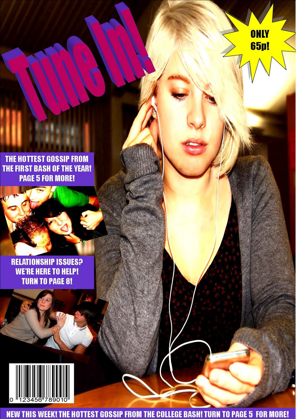
Possible front cover shot

Here is a photo that i have edited to make it more suitable to be on the front cover of a student magazine. It is a mid shot so you can clearly see the facial and body expression. I have chosen a different picture than the one that i posted on the blog before because there is a free space on the left to put cover lines etc.
I have brightened and raised the contrast of the photo, i have also cropped it so that it will fit suitably on an a4 page.
Thursday, 26 November 2009
Weekly Review
This week i have managed to complete my first design ideas and do the photo shoot. I think i have suitable photos that will be very effective on the front cover of a student magazine. Based on my Target audience research, i found out that they would like a student magazine to be about relationships music and college life, so that is what i have based my photos on. I am now beginning my proper design and hope to continue refining the design next week.
Wednesday, 25 November 2009


Possible Photos For The Front Cover


Here are some of the photos that i have taken that could be used on the front cover of my magazine for RELATIONSHIPS, MUSIC and COLLEGE LIFE.
Monday, 23 November 2009
RESULTS: What do the target audience want the magazine to be about?

As you can see, based on the results that i gathered from my questionnaire, College life, relationships and music scored highest. As a result of this, i have decided to put these themes into my magazine - it will be local to the people who buy it so they can find out news from their local college, but it will also include celebrity gossip about artists and can offer some relationship advice for those who need it. I believe that this magazine will appeal more to girls than to boys, so the coloir theme that i will be using will be classed as "girly" i.e pinks, yellows, etc. I will also use quite "girly" fonts that are pretty and eye catching. Photos will include photos of girls as well as boys but the coverlines will be speaking directly to girls, with titles such as "Need Help With Your Cheating Boyfriend?" etc.
Photoshoot Planning!
After looking at all the feedback i have had from my target audience (16-17 year olds) i have decided i would like my magazine to be about relationships, music and real life stories (college life). This is because i believe that it can appeal to a very wide audience - particularly girls.
Based on this, i need to plan a photoshoot that would provide photos suitable for this genre of magazine. I also need to plan the location of the photoshoot.
Some possible locations for the RELATIONSHIPS photoshoot could be:
- On a sofa - costa coffee?
- On a park bench
Situation:
- Girl looking upset, boy looking away
- Boy looking angry, girl looking upset
- Both happy, smiling
- Boy texting another girl, girl looking over shoulder
Some possible locations for the MUSIC photoshoot could be:
- In the drama studio - on stage?
- In the music room - on the drums / microphone / etc
Situation:
- A band playing
- Photo of girl singing
Some possible locations for the COLLEGE LIFE photoshoot could be:
- In the refectory
- Bash photos
- In lesson
Situation:
- Partying at the bash - coverline : GOSSIP
- Problems in the refectory
I want the models to be both boys and girls but i want the magazine to appeal to girls more. I might try and use a mixture of both colour and black and white photos but im not too sure yet.
Weekly Review
This week i have managed to complete everything on my action plan for the first week. This includes setting up my blog, making my first entries, researching existing magazines, constructing a questionnaire to find out what my target audience wants. I have also taken this a step further and designed 3 possible front covers for a student magazine. I have so far received five comments of feedback on my questionnaire - the answers were pretty predictable - most of them were from 16-17 year olds and they all wanted to see relevant up to date news and photos. The preferred genre of the magazine ranges from fashion and music to cars and sports.
Next week i plan to start on my photoshoot - i can decide on possible backdrops, models, clothing and situations. However this can only be done once i have decided what genre of magazine i would like it to be - i have a wide choice but have not yet decided. Once i have completed this i then intend to begin my design on the computer. I will continue designing this next week as well, until i have completed it to a high standard of work.
Next week i plan to start on my photoshoot - i can decide on possible backdrops, models, clothing and situations. However this can only be done once i have decided what genre of magazine i would like it to be - i have a wide choice but have not yet decided. Once i have completed this i then intend to begin my design on the computer. I will continue designing this next week as well, until i have completed it to a high standard of work.
Thursday, 19 November 2009
Possible Names....?
Trying to think of some possible names for the magazine and its really hard. Heres some that ive thought of, post your own ideas in a comment below pleeeease :)
- Catch Up (boring but clear)
- Disfunctional
- Teenage dispute
- Beyond teenage
- Tempted
i dont have a clue what else... any ideas?
- Catch Up (boring but clear)
- Disfunctional
- Teenage dispute
- Beyond teenage
- Tempted
i dont have a clue what else... any ideas?
3rd Design Idea
 My third design idea has tried to use some themes from both of my other designs - i have used a more interesting background than the first one but it is not as busy as the second one. It features a teenager on the front so i think it shows it is relevant for a student magazine. The hot pink and blue masthead (similar to my last design) also contrasts well with the background so it stands out. The coverlines are clear and there are just enough photos to make it interesting but not over crowded. This is my favourite design so far.
2nd Design Idea
 This is my second magazine design idea. I used a busy interesting background to attract the readers attention, but i think it is a bit too busy. I put the price inside a big bubble to show the readers that it is cheap. I used a hot pink colour for the masthead and strapline to try and contrast with the blue in the background. Overall i think it has an eye-catching appearance but is perhas a bit too busy for a student magazine.
1st Design Idea

Here is my frist design idea for the student magazine front cover.
I used a pink background to try and attract girls and tried to keep the background quite bland so that it wouldnt draw attention away from the masthead and coverlines. I like the 3D effect of the masthead and i think it would be quite interesting to have the masthead going down the side rather than across like other magazines normally would.
Tuesday, 17 November 2009
Target Audience Questionnaire - What Do They Want?
Here is a questionnaire to try and find out what the target audience would like to find in a student magazine. Please copy and paste it into a comment below, and write your answers underneath. Thanks.
1. What should the student magazine be about? Here are some examples...
- Music
- Cars
- Sports (Tennis / football / netball / etc)
- College life
- Relationships
-Other
2. What would be a suitable name for the student magazine? Write some suggestions below...
3. What font would you like the main headlines to be in? Here are some examples...
- Headline
- Headline
- Headline
- Headline
- Headline
- Headline
- Other
4. What do you think the price should be?
- 40p
- 50p
- 60p
- 70p
- 80p +
- Other
5. What kind of photos would you like to see on the magazine?
- Recent events
- Images or photos
- Hand drawn
- Don't care what the photos are of, you just want lots of them.
6. Would you prefer a black and white or a coloured magazine? What colour scheme would you prefer?
- Black and white
- Colour (Name some colour schemes: blue and pink, green and brown, etc)
- Both
7. How old are you?
- Under 13
- 13 - 15
- 16 - 19
- 20 +
8. How often do you read magazines?
- Every day
- Few times a week
- Once a week
- Once a month
- Never
9. What genre of magazines do you read most?
- Music
- Sport
- Technology
- Relationships
- Fashion
- Other
10. Are you a boy or a girl?
- Boy
- Girl
Thank you for taking part in this questionnaire.
Second Magazine Analysis - First Car

Secondly, i am analysing an issue of a magazine called "First Car". It is a little more expensive than the first magazine that i looked at, and it is also more professional looking. In contrast to the other magazine, this one does not highlight the price by placing it inside a bubble. This time it is placed quite discretely in the bottom right hand corner with the bar code. Perhaps this is because the price of £2.95 is a little bit too expensive for teenagers, unless they are really interested in this subject.
When you first look at the magazine you immediately notice the large photo of "The Inbetweeners" surrounding a car. This suggests that although the magazine is about cars, it may also include some celebrity information. This makes it appeal more to a wider teenage audience. The masthead is white, large and bold, and it sticks out really well against the dark background of the photo. The masthead also labels the brand identity really clearly - "Car" so this magazine particularly appeals to those interested in cars.
The layout appears more ordered than the first magazine, with many of the captions and photos in line with each other. There is also a very simple colour scheme with just yellow and white against the dark background. This makes it appear more organized and mature than the college "Student ID" magazine. In contrast to the organized appearance of photos and captions, there is a tilted headline that spans across the whole page in a larger font. This makes it really stick out from the other coverlines and gives it more power.
At the top of the page there is a strapline that gives the readers more information about what is included within the magazine, such as, "Competitions / Games & Gadgets / Advice & Tips" etc. This is trying to show the readers that this magazine is full of features that will interest and amuse you. Underneath the strapline there is also a column of coverlines. These follow the very ordered feeling of the rest of the magazine, and make it seem more mature.
Monday, 16 November 2009
First Magazine Cover Analysis - Student ID

I began my analysis with having a look at the college's own student magazine - "Student ID" issue. This is a rather cheap magazine as it is only 90p, and the publishers of the magazine have highlighted this by placing it in a bubble of a different colour. The magazine is found in reception of the school college.
Although not as glossy and polished as other more well-known magazines, this offers a wide range of subjects that appeal to young teenagers at Ludlow College. I find the cover quite stunning immediately, as there is a very loud, bright red front cover. When you look a little closer, you actually realise that it is a close up photo of a leaf in autumn, which is quite appropriate as this magazine issue was published during autumn.
Against the stark red background, there is a great contrast with the main masthead as it is white. It is on a slight tilt to make it appear more 'quirky' and appealing to teens, i also believe that the use of an interesting font (that resembles cut out newspaper letters) stands out more than a regular font such as Arial or Times New Roman.
This tilted theme is continued throughout the rest of the magazine, as all of the photos are also tilted. Some, such as those in the top right corner of the front cover, also overlap each other to give it a 'crazy' unorganized feel that is appealing to teens. It looks as if the photos have just been thrown into place, and gives the magazine a spontaneous and fun theme, mirroring the general stereotype of a teenager. In the photos themselves, we can see a lot of the students from the college enjoying themselves at the 'bash', and we can see that the colour in the photos has been saturated to make it seem more intense.
The cover lines are made to stand out from the rest of the magazine as they are placed inside an interesting text box of a different colour. They are also large and quite overpowering within the front cover - they can clearly be seen and read. The cover lines can each be defined as different to another one because they are all in different sizes and fonts. They are also tactically placed on the front cover next to certain pictures that they relate to, for instance, there is a photo of the Big Brother logo, followed by the cover line "We're Watching Big Brother".
Finally, a banner that spans across the width of the front page of the Student ID can be seen at the bottom of the page. It is of a different colour and the font inside it is large and bold. It is a good overview of what can be found inside the magazine because it gives all of the main stories; "Art at the College / ID Cards / Horoscopes".
Action Plan
Week One
1. Set up my blog.
2. Make my first entry - plan of action.
3. Research on existing student magazines, upload photos and comment.
4. Decide on target audience.
5. Construct an audience questionnaire - what they want to see on a student magazine.
Week Two
1. Mock designs - draw by hand, scan in to the computer and upload to the blog. Ask for feedback from the target audience.
2. Organize and do the photo shoot - sort out models, backdrops, etc.
3. Begin design on computer.
Week Three
1. Continue designing.
2. Complete first draft of pages, get feedback from the audience.
3. Make appropriate changes based on the feedback i have received.
Week Four
1. Finish pages and check that itis all up tothe same standard.
2. Evaluate.
Subscribe to:
Comments (Atom)
