Sunday, 28 February 2010

Double Page Spread Draft


This week i have been designing my double page spread for the magazine. I decided to focus my article on a band profile of Liam Evans, lead singer of band 'Scum of earth'. The idea is that within the magazine there are more band profiles on each of theband members.

Im pleased with how i kept to the colour scheme in the rest of the magazine - red, black and white. I also really like the cascading montage of photos down the centre fold - i think this is a nice transission from the main images to the block of text.

Monday, 22 February 2010

Weekly Review

This week i have designed and produced both my front page and my contents page. Firstly though i produced my layout designs so that i had some idea of how to put it all together. I am relatively happy with what i have produced - i specially like the red, black and white colour theme that has been consistent throughout my designs. Also i like how ive edited the photos to make them look more attractive to the readers. OVerall i think they are two effective pages for my magazine. This week i plan to design my double page spread with lots of interesting information about the imaginative band "Scum Of Earth".

Sunday, 21 February 2010

Double page spread planning

Before i begin my designs on my double page spread, i have decided to plan out what exactly I'm going to feature in it.
I want to include:
- One large main image
- A montage of smaller images
- An interview with the star
- Some background information on the band
- What the band are hoping to do next

Here are some ideas as to what i could write:
"Liam Evans: Lead Singer of new upcoming band Scum Of Earth

[Intro]
Winning smiles, casually ruffled hair, sharp suits - I have to admit the lads from all-new Scum Of Earth were enough to set my heart beating that tiny bit faster. Fighting my way through the jostling crowds of the Brit Awards 2010, I managed to corner the group for an in-depth, exclusive interview. Settled down with several plastic cups of tea and coffee, I asked Liam, Sam, Ginge and Kath how exactly they were coping with their new-found fame.


[Interview]
It's been quite a year for you as a group - the immediate struggle to break through into a relatively new genre of music must have been difficult. But now you're here collecting 2 Brit Awards for your amazing efforts - how did you do it?
[Kath] (laughing) When you say it like that you make it sound easy! I can promise you it wasn't at all. (looking at the other members)
[Sam] The hardest part was the beginning. We found that all the music we were hearing sounded the same - there was nothing new, or different - then we saw our chance. We'd been working together as a group for a few years, but didn't really make it big. To be fair, we had a completely different style a few years ago to what we are now - we've changed to suit what the music world was lacking. Once we found our new style things became much easier - it seemed natural.


To be continued........

Thursday, 18 February 2010

Contents Page Draft


After finishing my front page design i decided to begin my designs for my contents page. Here is what I have so far produced - i am very happy with the results. I particularly like the effects that i have used on each of the photos - tilting, framing, etc. Also i really like how i scanned in an image of my signature and uploaded it, this makes it seem more realistic and personal to the readers.

Friday, 12 February 2010

Updated Front Cover Design


To finalize my design i have added one more feature to the front page - an image and coverline concerning "Big Chill Festival 2010". I think overall this has the effect of making the magazine front cover busier and more interesting. I am very pleased with my final result.

Thursday, 11 February 2010

Front Cover Final Design


Here is my final design for my front cover. I have added many more coverlines and a few more photos, as well as a bar code to make the magazine look packed with interesting articles. It also looks more realistic, and reflective upon my analysis of "Q" magazine.

Front Cover Draft Design


Here is a draft design for my front cover. I really like the font used for the masthead, but i think the overall design could be improved with some additional coverlines and photos. I will keep the same basic layout and colour scheme but adjust it to make it more presentable to the readers.

Tuesday, 9 February 2010

Double page spread layout designs


Here are some layout designs for my double age spread. I like the idea of having polaroid effect photos merging with the main image and the article content, and i also like the idea of interviews alongside the actual article. I plan on combining multiple ideas from both layouts for my final design.

Contetns Page Draft Layouts


Here are some more layouts of contents pages that i have designed, based on the magazines that i have analysed.
I think i prefer the second one because there is more room to write page references - this suggetss to the readers that the magazine is packed full of interesting articles to read.

Front Page Draft Layouts


Here are two draft layouts that i have designed and plan to base my final designs on. Both feature one large image as the focal point of the page - this is reflective of Q magazine. I am undecided as yet which picture to put on the front page - either just the lead singer or the whole band shot.


Monday, 8 February 2010

Weekly Review

This past week i have finished my photoshoot and uploaded some of them to the blog. I have also edited the effects on the photos to make them more dynamic and suitable for the magazine. I have also decided on a name and genre for the music magazine - 'Jammin' an indie magazine. I am in the process of deciding which possible font to use for my titles.
Next week i plan to finish my "Magazine treatment" and my mock layouts, so that i can begin my final designs.

Sunday, 7 February 2010

Photos cont.


I have been editing some of the photos that could be used on the front cover and double page spreads. I have edited the colouring - i.e sepia, black and white, also the brightness and contrast. I have also retouched some aspects of the photo, such as blemishes on the skin.


Here are the results.

Possible fonts for the front cover


Here are a range of fonts that i have selected that could be suitable to be used on my front cover and inside the magazine for headlines etc.

I have also decided to use the name "Jammin" for my magazine as my target audience preferred it. It is also relevant because it is the name of a song by Bob Marley.

Thursday, 4 February 2010

Photoshoot continued...


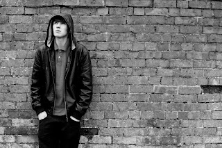
After i finished photographing possible locations, i then decided to organize multiple shoots with a range of models. I wanted the photos to reflect the 'indie' music scene, and used models that would fit in this catagory. The locations also were suitable for an indie magazine.


Above are some samples of the photos that may be suitable for the FRONT COVER:


Possible Names For The Magazine

Which name do you prefer for the magazine?
Crunk
Krunkd
MyMusic
Jammin
Fuse
pollcode.com free polls
I have created a poll for my target audience to fill in,so i can base my name of magazine on what they really want.

Photoshoot......


This past week i have been planning and carrying out my photoshoot ideas. I trialed a range of different locations, some of which are below:
(Please note that they are in no way edited and are just raw material)